Connect adoption
Databank: agentic companies scored8,412 / 10,000
Outreach batch 7 draftedneeds_you
Embedders Desk password gatedone
Click and type. Small caps are synthesized by the browser until real ones are drawn.
01 · Uno Serif
Hooked terminals, wedge serifs and a text cut that holds at 16px. Two axes: weight 400 to 900 and optical size 16 to 72, so headlines get sharper and paragraphs get sturdier on their own.
One sits between an agent and the apps it acts on. You connect each app once, in your own One account, and decide what each agent may do. Agents get a grant, never a credential. A call outside the grant gets a 403 and never reaches the provider. Every action is on the record, and revocation is one click.
Connecting stays free. Revenue comes from enterprise plans, hosted agents, and higher rate limits. The product never handles a credential: a button, two backend routes, OAuth 2.1 with PKCE.
02 · Uno Grotesk
The memory of Akzidenz with a straight-stemmed a, a flat-topped t, a spurless G and terminals cut against the stroke. For interfaces, body copy and everything that should get out of the way.
One sits between an agent and the apps it acts on. You connect each app once, in your own One account, and decide what each agent may do. Agents get a grant, never a credential. A call outside the grant gets a 403 and never reaches the provider. Every action is on the record, and revocation is one click.
Connecting stays free. Revenue comes from enterprise plans, hosted agents, and higher rate limits. The product never handles a credential: a button, two backend routes, OAuth 2.1 with PKCE.
03 · Uno Mono
The grotesk's a, c and s moves at a fixed width, with a slashed zero and box drawing. For code, connection ids and anything that has to line up.
const grant = await one.connect({ app: "gmail", scopes: ["mail.send"] });
if (!grant.allows("mail.send")) return res.status(403).end();  // never reaches Gmail
await one.actions.execute("gmail", "messages.send", grant, { to, subject, body });
┌──────────────┬──────────┬─────────┐
│ connection   │ calls/24h│ status  │
├──────────────┼──────────┼─────────┤
│ conn_7f3a9c  │   12,480 │ ok      │
│ conn_0b11e2  │      403 │ revoked │
└──────────────┴──────────┴─────────┘
In use
Connect each app once, in your own One account, and decide what each agent may do. Agents get a grant, never a credential.
Use it
Self-host the three woff2 files from the download below. Each is one variable file, so every weight is a single request.
/* fonts/ holds UnoSerif.woff2, UnoGrotesk.woff2, UnoMono.woff2 */ @font-face { font-family: "Uno Serif"; src: url(/fonts/UnoSerif.woff2) format("woff2"); font-weight: 400 900; font-display: swap; } @font-face { font-family: "Uno Grotesk"; src: url(/fonts/UnoGrotesk.woff2) format("woff2"); font-weight: 400 900; font-display: swap; } @font-face { font-family: "Uno Mono"; src: url(/fonts/UnoMono.woff2) format("woff2"); font-weight: 400 700; font-display: swap; } /* italics: same family name, font-style: italic */ @font-face { font-family: "Uno Serif"; src: url(/fonts/UnoSerif-Italic.woff2) format("woff2"); font-weight: 400 900; font-style: italic; font-display: swap; } @font-face { font-family: "Uno Grotesk"; src: url(/fonts/UnoGrotesk-Italic.woff2) format("woff2"); font-weight: 400 900; font-style: italic; font-display: swap; } @font-face { font-family: "Uno Mono"; src: url(/fonts/UnoMono-Italic.woff2) format("woff2"); font-weight: 400 700; font-style: italic; font-display: swap; } :root { --font-serif: "Uno Serif", Georgia, serif; --font-sans: "Uno Grotesk", system-ui, sans-serif; --font-mono: "Uno Mono", ui-monospace, monospace; } body { font-family: var(--font-sans); } h1, h2 { font-family: var(--font-serif); font-weight: 500; } code, pre { font-family: var(--font-mono); }
// app/fonts.ts import localFont from "next/font/local"; export const unoSerif = localFont({ src: [ { path: "./UnoSerif.woff2", weight: "400 900", style: "normal" }, { path: "./UnoSerif-Italic.woff2", weight: "400 900", style: "italic" }, ], variable: "--font-serif", display: "swap", }); // same pattern for Grotesk and Mono export const unoGrotesk = localFont({ src: "./UnoGrotesk.woff2", weight: "400 900", variable: "--font-sans", display: "swap", }); export const unoMono = localFont({ src: "./UnoMono.woff2", weight: "400 700", variable: "--font-mono", display: "swap", }); // app/layout.tsx <html className={`${unoSerif.variable} ${unoGrotesk.variable} ${unoMono.variable}`}>
/* app.css, after the @font-face rules from the CSS tab */ @import "tailwindcss"; @theme { --font-serif: "Uno Serif", Georgia, serif; --font-sans: "Uno Grotesk", system-ui, sans-serif; --font-mono: "Uno Mono", ui-monospace, monospace; } <!-- then --> <h1 class="font-serif text-6xl font-medium">The trust layer for AI agents.</h1> <p class="font-sans">Agents get a grant, never a credential.</p> <code class="font-mono">conn_7f3a9c</code>
/* Optical size: automatic from font-size. Pin the display cut on heroes: */ .hero { font-family: "Uno Serif"; font-variation-settings: "opsz" 72; } /* Figures that line up in tables and counters */ .num { font-variant-numeric: tabular-nums; } /* Slashed zero, so 0 and O never get confused (Grotesk and Mono) */ .id { font-feature-settings: "zero" 1; } /* Capital-height punctuation for ALL CAPS labels */ .label { text-transform: uppercase; font-feature-settings: "case" 1; }
Process
Uno starts from open-source typefaces and changes them in code. Every letterform edit is a short script applied the same way to every weight and to the italics, so the family stays one system.
Instead of drawing a thousand glyphs from zero, we started from typefaces released under the SIL Open Font License, which allows modifying and renaming. Four serif and four sans candidates were set in One's real copy and compared side by side. Newsreader won the serif: text-ready, a full weight range and an optical size axis. Schibsted Grotesk won the sans: the closest Akzidenz bones. Roboto Mono came later for the mono.
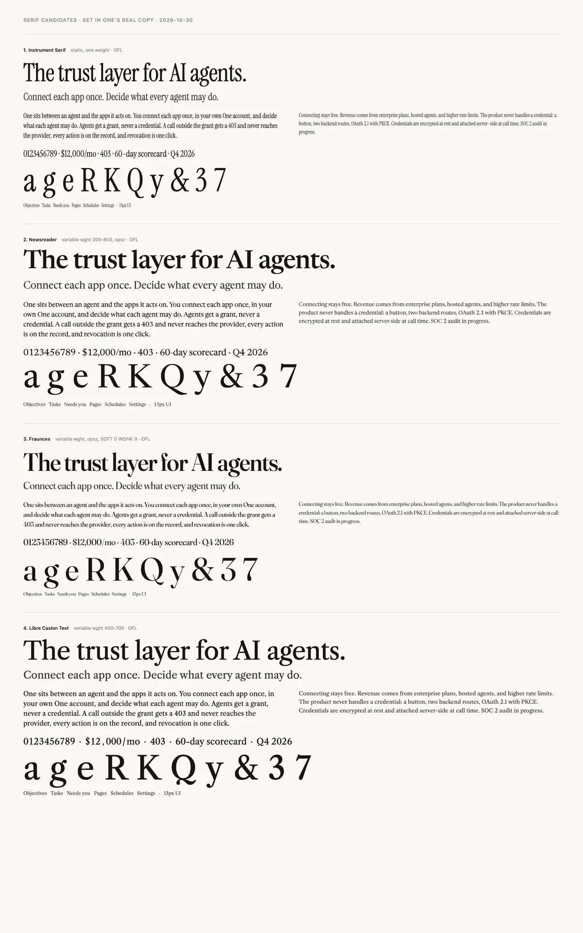
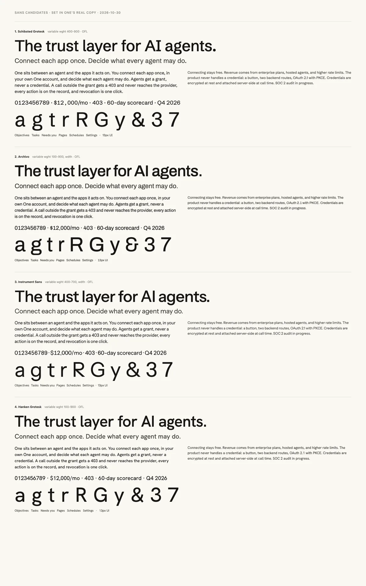
We pulled each skeleton's original design files (UFO and Glyphs sources) from its public repository, not the compiled fonts. A build script resets them to pristine every run, applies our edits, and compiles variable fonts with fontmake. Nothing is hand-patched, so any change can be undone or redone in seconds.
People recognise a typeface by a few dozen glyphs, so that is where the work went. Each edit moves specific outline points to positions defined as fractions of that glyph's own shape, identically in every master, so the weight and size axes still interpolate cleanly.
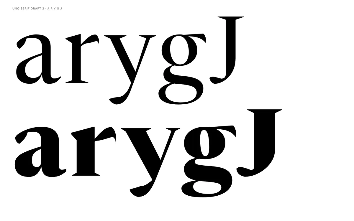
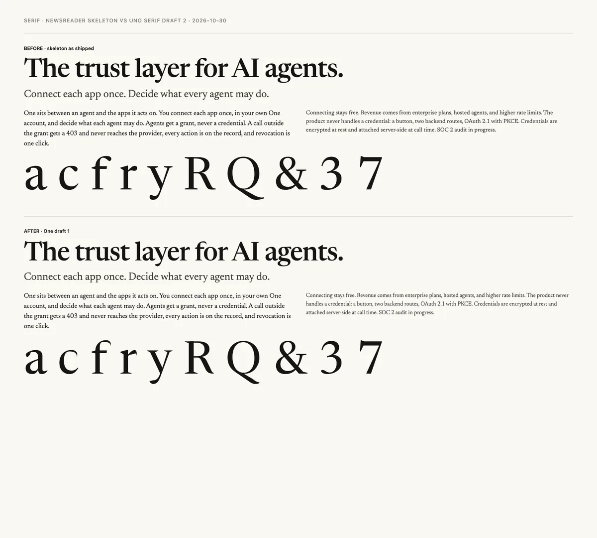
Every change was rendered to an image in a real browser and judged by eye: before against after, huge glyphs at 420px, spacing strings like "ra re ro ry", and the website hero. Two rounds of notes went in (a fuller belly on the a, a rounder r, a cleaner R foot in Black). A coverage audit confirmed Latin, Latin-1 and nearly all of Latin Extended-A.
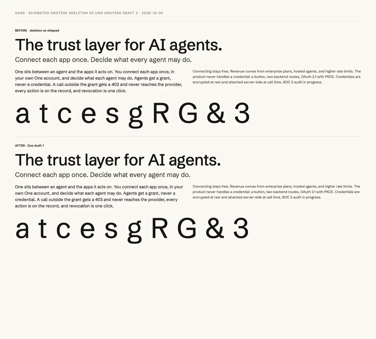
Each skeleton ships its own italic. A transfer script takes every upright edit as a movement, skews it by the italic angle and applies it wherever the italic glyph has the same structure: the serif's capitals, wedges, J, R and Q, and the grotesk's G, c, e, s and t. The rest keep their true italic forms, like the cursive serif lowercase and the single-storey grotesk a.
One variable woff2 per family and style, subset to Latin. The art on this page was generated with Higgsfield in the same botanical system as One's ad creative, with a light twin for each image. This page is the review copy; nothing changes on withone.ai or Clockwork until the design is approved.
Newsreader by Production Type. Schibsted Grotesk by Schibsted. Roboto Mono by Christian Robertson for Google. All SIL Open Font License 1.1; Uno keeps that license and none of their reserved names. Inspired by, not derived from, Domaine Text and Söhne by Klim Type Foundry.
Download
Serif, Grotesk and Mono, each upright and italic. TTF for design tools, WOFF2 for the web, one variable file per style.
SIL Open Font License 1.1. Derived from Newsreader (Production Type), Schibsted Grotesk (Schibsted) and Roboto Mono (Google), whose reserved names are not used. Draft for internal review; not a public release.